top of page
Owkins Souvenirs
Owkins, based in the Caribbean paradise of San Andrés and Providencia, Colombia, specializes in souvenirs for both local and global tourists. They're all about capturing the special memories and experiences of your vacations.
Branding, Logo Redesign, Product Design

THE GOAL
The primary objective for Zenda Studios, in redesigning Owkins' visual identity, was to create a more robust and communicative brand compared to its previous logo-centric approach. Understanding Owkins' business model and pinpointing key touchpoints with its audience, the goal was to establish a clear and engaging communication strategy. This involved simplifying the brand messaging without losing warmth and excitement.
The primary objective for Zenda Studios, in redesigning Owkins' visual identity, was to create a more robust and communicative brand compared to its previous logo-centric approach. Understanding Owkins' business model and pinpointing key touchpoints with its audience, the goal was to establish a clear and engaging communication strategy. This involved simplifying the brand messaging without losing warmth and excitement.
THE APPROACH
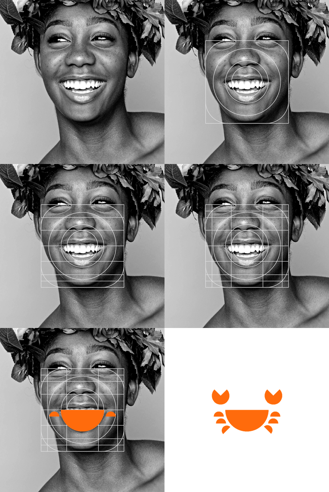
Derived from the founder's surname, Owkin’s, the brand name was chosen for its personal connection. The logo, a synthesis of a smile and half a circle, became the foundation for the main symbol—a crab, representing one of Providencia Island's most common and sought-after animals. Zenda Studios utilized this iconic smile element creatively, incorporating it into containers, cards, stickers, and even constructing icons. The vibrant color palette, featuring lively hues with a dominant orange, captures the warmth and youthful spirit of Owkins' products. The tagline, "Vacations never end," proposed by one of the founders, perfectly aligns with the brand's concept—Vactions never ends - acquiring an Owkins product is like taking a piece of vacation that lasts for years.
Derived from the founder's surname, Owkin’s, the brand name was chosen for its personal connection. The logo, a synthesis of a smile and half a circle, became the foundation for the main symbol—a crab, representing one of Providencia Island's most common and sought-after animals. Zenda Studios utilized this iconic smile element creatively, incorporating it into containers, cards, stickers, and even constructing icons. The vibrant color palette, featuring lively hues with a dominant orange, captures the warmth and youthful spirit of Owkins' products. The tagline, "Vacations never end," proposed by one of the founders, perfectly aligns with the brand's concept—Vactions never ends - acquiring an Owkins product is like taking a piece of vacation that lasts for years.
Owkins Behance Project
Hired Services:
Logo Design
Visual Identity Design
Merchandising
Concept Art & Illustration
Product Design
Graphic Design
Visual Identity Redesign, Art & Illustration: Facundo Kostelak
bottom of page