top of page

HEDDWAY

HEDDWAY is a company focuses on helping people and teams improve their mental well-being. They offer one-day courses, workshops, and keynote speaking to empower individuals with practical tools for emotional balance, resilience, and staying positive in the face of life's challenges.

Logo Design, Visual Identity, Copywriting

THE GOAL

HEDDWAY wants to simplify mental well-being by sharing easy-to-understand knowledge and guiding individuals towards mental fitness.

In creating a lasting visual identity for HEDDWAY's growth, our focus has been on clarity and maintainability. We've designed a visual representation that captures HEDDWAY's essence and its unique approach to course delivery, expressing its "mental fitness" philosophy with precision and simplicity. The visual identity underscores the importance of mental health without unnecessary complexities.

HEDDWAY wants to simplify mental well-being by sharing easy-to-understand knowledge and guiding individuals towards mental fitness. In creating a lasting visual identity for HEDDWAY's growth, our focus has been on clarity and maintainability. We've designed a visual representation that captures HEDDWAY's essence and its unique approach to course delivery, expressing its "mental fitness" philosophy with precision and simplicity. The visual identity underscores the importance of mental health without unnecessary complexities.

THE APPROACH

We have focused on doing a brand study, understanding its objective and mission to connect even more with its vision.

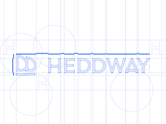
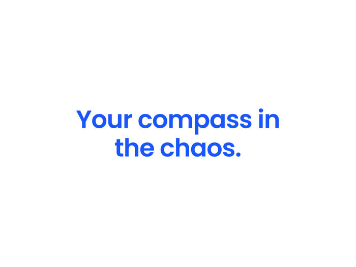
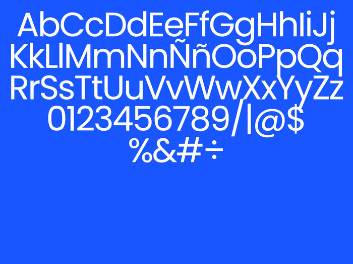
In crafting the HEDDWAY brand, we dove into minimalist creative concepts, guided by a copywriter's finesse in weaving engaging metaphors and analogies. ‘Hedd’ means ‘Peace’ in Welsh and the HEDDWAY symbol is inspired by its tagline, "your compass in the chaos," aiming to be the compass guiding through the storm created by workplace stress. Depicted as a boat with sails formed by the fusion of its "double Ds" and a subtle wave as its base, creating implicit movement. The primary font, Poppins, was chosen for its digital and friendly vibe, aligning seamlessly with HEDDWAY conversational style – fresh, clear, and approachable. The resulting combo logo is both iconic and dynamic.

Inspired by the founder's preference, blue became the primary color, complemented by a palette categorization: 1. Essential usage, 2. Alternatives and complementary use, and 3. Optional for graphics and statistics – crucial elements in presenting Heddway's courses, showcasing a more open palette.

Our iconography follows a linear design, ensuring consistency, minimalism, and a breath of fresh air in each icon. Representing subjective concepts objectively posed a challenge, yet we crafted a family of icons that evoke an emotional experience without sacrificing iconicity or communication effectiveness. This stylistic approach has been seamlessly maintained across all illustrations.

We have focused on doing a brand study, understanding its objective and mission to connect even more with its vision. In crafting the HEDDWAY brand, we dove into minimalist creative concepts, guided by a copywriter's finesse in weaving engaging metaphors and analogies. ‘Hedd’ means ‘Peace’ in Welsh and the HEDDWAY symbol is inspired by its tagline, "your compass in the chaos," aiming to be the compass guiding through the storm created by workplace stress. Depicted as a boat with sails formed by the fusion of its "double Ds" and a subtle wave as its base, creating implicit movement. The primary font, Poppins, was chosen for its digital and friendly vibe, aligning seamlessly with HEDDWAY conversational style – fresh, clear, and approachable. The resulting combo logo is both iconic and dynamic. Inspired by the founder's preference, blue became the primary color, complemented by a palette categorization: 1. Essential usage, 2. Alternatives and complementary use, and 3. Optional for graphics and statistics – crucial elements in presenting Heddway's courses, showcasing a more open palette. Our iconography follows a linear design, ensuring consistency, minimalism, and a breath of fresh air in each icon. Representing subjective concepts objectively posed a challenge, yet we crafted a family of icons that evoke an emotional experience without sacrificing iconicity or communication effectiveness. This stylistic approach has been seamlessly maintained across all illustrations.

HEDDWAY Linkedin


Hired Services:

Logo Design

Iconography Design

Stationery Design

Presentation Templates

Custom Mockups

Stationary Design

Social Media Assets

Landing Page Design

Merchandesign


Creative Direction & Brand Identity Design: Facundo Kostelak

Creative Copy: Victor Morón

Creative Advisor: Catalina Mendivil Castellote

bottom of page