top of page

Fit4Life

Fit4Life, Spain's leading fitness tech distributor, refreshes its 15-year-old brand identity, aiming to meet market trends and strengthen its industry lead.

Branding, Logo Design

THE GOAL

At the heart of the endeavor lies a core objective—to refresh Fit4Life's brand identity, vividly capturing its prominent position as a trailblazing distributor in the fitness and technology realm. The aim is to simplify the existing complex wordmark, ushering in a fresh, cohesive visual identity that effortlessly balances readability with distinctiveness.

Furthermore, the project sets out to redesign the symbol to enhance application while staying true to its original essence of exuberant vitality. The aspiration is to establish a versatile visual system, seamlessly adaptable to a myriad of scenarios and touchpoints.

At the heart of the endeavor lies a core objective—to refresh Fit4Life's brand identity, vividly capturing its prominent position as a trailblazing distributor in the fitness and technology realm. The aim is to simplify the existing complex wordmark, ushering in a fresh, cohesive visual identity that effortlessly balances readability with distinctiveness. Furthermore, the project sets out to redesign the symbol to enhance application while staying true to its original essence of exuberant vitality. The aspiration is to establish a versatile visual system, seamlessly adaptable to a myriad of scenarios and touchpoints.

THE APPROACH

In pursuit of the objective, the comprehensive rebranding journey unfolds, commencing with the intricate process of simplifying the complex wordmark. Skillfully interweaving horizontal and diagonal lines, the result is a harmonious and captivating visual identity that enhances readability while resolutely preserving its distinctive character.

In a momentous resurgence, the symbol undergoes a transformation, with the integration of the letter "F," an athlete's anatomy, and an ascending arrow. This design choice accentuates functionality while preserving the original vigor that the symbol emanates.

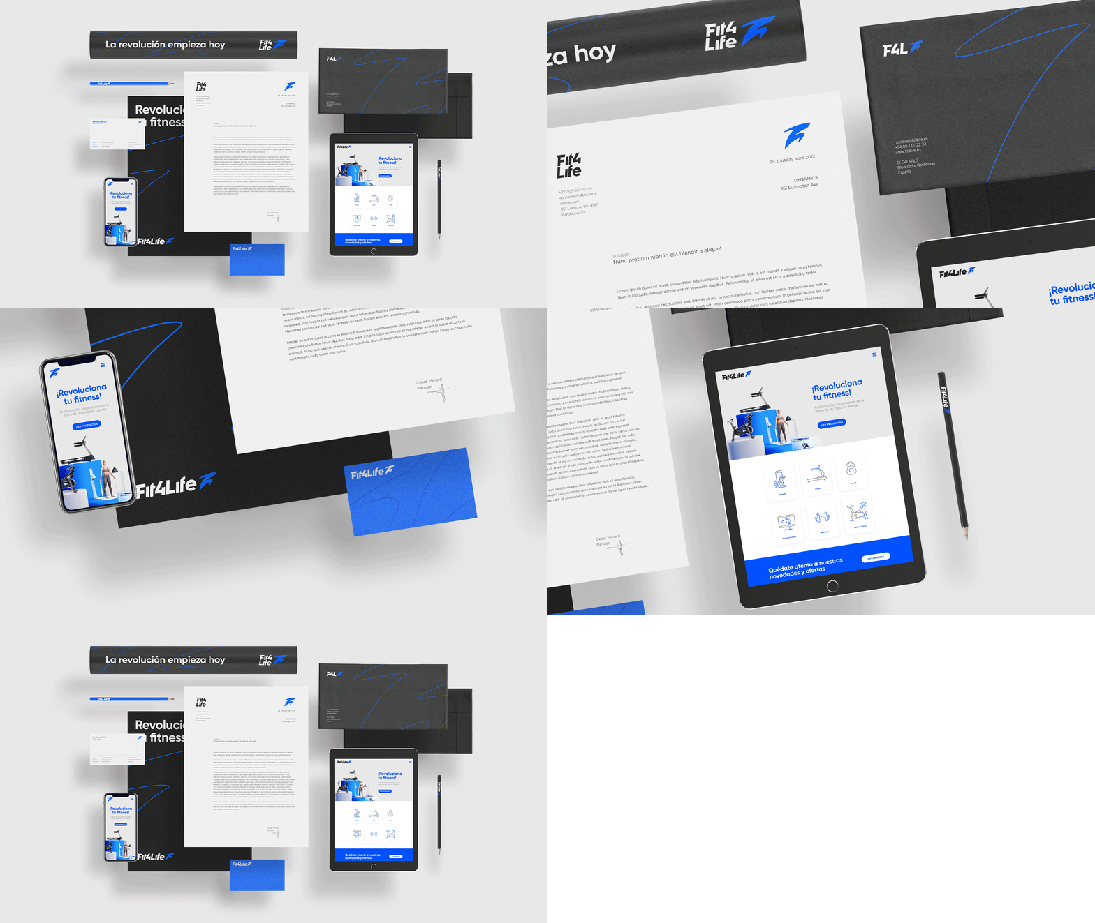
The visual system embodies adaptability and dynamism, catering to diverse scales and scenarios. Frames inspired by the symbol's anatomy and athlete/product imagery form a cohesive framework, ensuring steadfast consistency and unparalleled flexibility across all branding touchpoints.

Beyond the scope of stationery, the visual system ventures into diverse lockups, tailored for a multitude of situations and circumstances.
To streamline product classification, a set of simple icons is designed, encapsulating and categorizing the extensive product portfolio. This thoughtful approach facilitates efficient distribution and seamless recognition on the brand's website.

Meticulously curated, the structured identity harmoniously merges elements, employing grid systems to achieve an exceptional synthesis of form and function.

We've revamped Fit4Life's communication, inside and out. Plus, we've created digital assets for an electrifying brand activation campaign aimed at connecting with its audience. This energetic identity aligns with the promotion of new tech products, not just a random spark.

In pursuit of the objective, the comprehensive rebranding journey unfolds, commencing with the intricate process of simplifying the complex wordmark. Skillfully interweaving horizontal and diagonal lines, the result is a harmonious and captivating visual identity that enhances readability while resolutely preserving its distinctive character. In a momentous resurgence, the symbol undergoes a transformation, with the integration of the letter "F," an athlete's anatomy, and an ascending arrow. This design choice accentuates functionality while preserving the original vigor that the symbol emanates. The visual system embodies adaptability and dynamism, catering to diverse scales and scenarios. Frames inspired by the symbol's anatomy and athlete/product imagery form a cohesive framework, ensuring steadfast consistency and unparalleled flexibility across all branding touchpoints. Beyond the scope of stationery, the visual system ventures into diverse lockups, tailored for a multitude of situations and circumstances. To streamline product classification, a set of simple icons is designed, encapsulating and categorizing the extensive product portfolio. This thoughtful approach facilitates efficient distribution and seamless recognition on the brand's website. Meticulously curated, the structured identity harmoniously merges elements, employing grid systems to achieve an exceptional synthesis of form and function. We've revamped Fit4Life's communication, inside and out. Plus, we've created digital assets for an electrifying brand activation campaign aimed at connecting with its audience. This energetic identity aligns with the promotion of new tech products, not just a random spark.

Fit4Life Web


Hired Services:

Rebranding

Stationary Design

Iconography

Web Design

Animation


Creative Direction & Brand Identity Design: Facundo Kostelak

Brand Identity Design: Bautista de Lusarreta


bottom of page