CON MANOS DE MUJER
CMM, a distinguished certification by MAYACERT S.A., stands as a powerful tribute to the impactful contributions of women in diverse social and production realms. This prestigious seal not only honors women's labor but also strives to empower them economically while championing gender equity across various sectors.
Services
LOGO REDESIGN
Year
2023


THE CHALLENGE
THE SOLUTION
The central objective promoted by CON MANOS DE MUJER is to safeguard and exalt the work of countless women involved in social and productive relationships, parallel to the efforts of any man. This is why our redesign of Symbol, the seal, must fulfill the primary function of identifying Latin American women and their invaluable work in the production and supply chain. At the same time, it must be a versatile and responsive design that will be used in an infinite number of formats, primarily in small sizes.
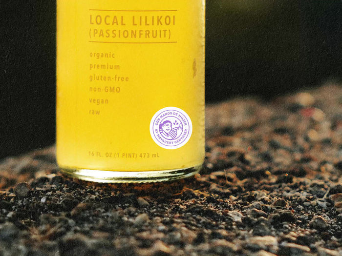
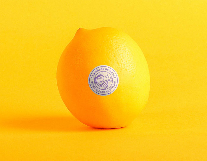
In a masterstroke of visual storytelling, CON MANOS DE MUJER's logo was thoughtfully redesigned. The new symbol portrays a woman striding forward with unwavering confidence, her gaze firmly fixed on the future, embodying movement, progress, and the essence of freedom. The incorporation of a bird in flight, a subtle touch of symbolism, poignantly emphasizes women's freedom in their work. With the repeated shape of three ovals representing both seeds and eggs (the beginning of plant and animal life in many cases), artfully forming an invisible ascending triangle, symbolizing growth and empowerment. Evoking a profound sense of context, the iconic lines left by cultivation assume the role of two hands, fiercely safeguarding the earth—a potent representation of product traceability.
The vibrant purple color, derived from women's advocacy movements, symbolizes transparency, clarity, and security—essential values embraced by the CON MANOS DE MUJER project.
For the brand's voice, we employ the esteemed Rubik typeface family—a sans-serif font bearing soft and subtle rounded edges, flawlessly articulating strength and warmth.
In essence, this synthesis coalesces into a single, simpler, clearer, more versatile, and immensely powerful symbol that magnifies the resilience, strength, and unwavering determination of women. CON MANOS DE MUJER celebrates their resplendent achievements, ardently advocating for their rights and serving as an invigorating beacon of hope, propelling positive change, and inspiring a brighter future—a future brimming with boundless possibilities for all."

BEHIND THE PROJECT
WHAT WE DID
Creative Direction & Identity Redesign: Facundo Kostelak
Graphic Design and Content Design Support: Franco Maidana
Sound Design & Music Producer: Leonel Kostelak
Social Media Content Advisor: Florencia Marcik
Visual Identity
Iconography
Custom Mockups
Social Media Assets
Visual Identity
Web Design
Photography Editing
Copywriting & Content Support
Creative Advisory


